Session Time Flow
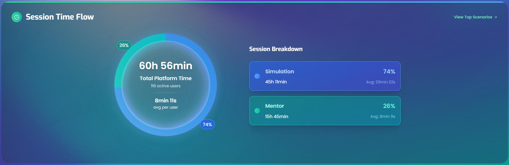
The Session Time Flow panel shows how time is being spent on the platform, broken down by activity type. It helps clarify whether learners are spending their time in simulations, with the mentor, or a mix of both.
What data is shown
This panel answers: how much time are learners spending on the platform, and what are they doing with that time?
The platform tracks two types of activity:
- Simulation time - The time users spend in the practice conversation itself - the interactive role-play where learners practice conversations and skills with the conversation partner. This includes only the active practice portion, not the feedback.
- Mentor time - The time users spend with the mentor. This includes two things:
- Post-simulation feedback - The mentor reviewing the learner's performance after a simulation ends.
- Open discussions - Standalone sessions where the learner has a free-form conversation with the mentor outside of any specific simulation.
All times are calculated from actual conversation records within the selected time period, user groups, and courses. Each simulation session is broken down into its individual conversation segments, and each segment's duration is classified as either simulation or mentor time based on its type.
The "Total Platform Time" shown in the center is the sum of simulation and mentor time. The "Average per user" divides that total by the number of active users, showing how much time each engaged learner is investing on average.
The donut chart
The left side of the panel features a donut chart with two segments:
| Segment | Color | What it measures |
|---|---|---|
| Simulation | Blue | Time spent in practice simulations - the interactive role-play sessions |
| Mentor | Teal | Time spent with the mentor - feedback reviews and open discussions |
The center of the chart displays:
- Total Platform Time - The combined simulation and mentor time for all users in the selected period.
- Active users - The number of active users contributing to this total.
- Average per user - Total platform time divided by the number of active users.
Percentage labels appear on the outer edge of each segment showing how the time splits between simulation and mentor.
Session breakdown legend
The right side of the panel shows two detailed cards - one for Simulation and one for Mentor. Each card includes:
- Category name and its percentage of total time.
- Total time for that category across all users.
- Average time per active user.
Interactive features
Hovering over a segment in the donut chart highlights the corresponding legend card, and vice versa. This makes it easy to explore the relationship between the visual chart and the detailed numbers.
Navigating to detailed charts
At the top-right of the panel, there's a View Top Scenarios link. Clicking it scrolls down to the Most Popular Scenarios chart for a scenario-level breakdown of where time is being spent.