Filters and Controls
The filter bar sits at the top of the page and controls which data is shown across every panel and chart. It determines the time window, which users are included, and which courses to measure. Understanding these controls is key to getting the most out of Usage Analytics.
Changing any filter immediately recalculates all numbers and refreshes every panel on the page.

Time Period
The time period picker determines the date range for all analytics data. It includes several predefined options and a custom range option.
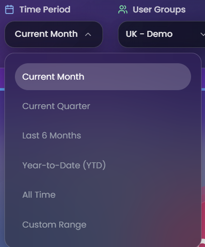
| Option | What it covers |
|---|---|
| Current Month | From the 1st of the current month to today |
| Current Quarter | The last three months |
| Year to Date | From January 1st of the current year to today |
| Last 6 Months | A rolling six-month window from today |
| All Time | From when the company was created up to today |
| Custom | Pick any start and end date manually |
The selected time period also determines which granularity options are available in the charts below. For example, "Current Month" allows daily and weekly views, while "Year to Date" shows monthly data. See Charts for the full mapping.
User Groups
The user groups dropdown is a hierarchical multi-select for focusing on specific parts of the organization.
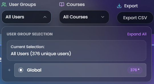
- Global - The default selection. Includes all users across every region and cohort.
- Regions - Selecting a region includes all of its cohorts automatically. Each region shows a user count next to its name.
- Cohorts - Nested under their parent region. Individual cohorts can be selected for more targeted analysis. Each cohort shows its own user count.
The number displayed next to each group (e.g. 376*) is the count of unique users in that group. The asterisk (*) indicates that a tooltip is available - hovering over it explains that the count represents unique users.
Selections can be combined freely - for example, two specific regions plus one cohort from a third region.
Courses
The courses dropdown shows all courses available for the currently selected user groups. It's a multi-select that supports one, several, or all courses.
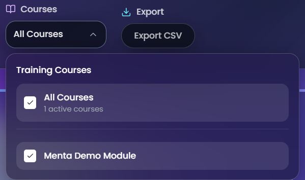
When user groups change, the course list updates automatically:
- If previously selected courses still exist in the new group, they stay selected.
- If none of the previous courses match, all available courses are selected by default.
Export CSV
The Export CSV button in the filter bar downloads a CSV file containing analytics data based on the current filter selections. This is covered in detail on the Exporting Data page.
How filters work together
All four controls are interconnected:
- Time period sets the date range for all data and determines which chart granularity options are available.
- User groups determine which users are included in every calculation, and also control which courses appear in the courses dropdown.
- Courses further narrow the data to simulations and scenarios within the selected courses.
- Export CSV captures everything that matches the current combination of filters above.
Changing any one filter triggers a refresh of all panels and charts on the page.
Which sections are affected by which filters
| Section | Time period | User groups | Courses |
|---|---|---|---|
| User Engagement | Yes | Yes | Yes |
| Session Time Flow | Yes | Yes | Yes |
| Simulations Played | Yes | Yes | Yes |
| Satisfaction Metrics | No (always all-time) | Yes | Yes |
| Active Users chart | Yes | Yes | Yes |
| Churned Users chart | Yes | Yes | Yes |
| Scenario Completion Tiers | Yes | Yes | Yes + own course filter |
| Most Popular Scenarios | Yes | Yes | Yes + own course filter |
Satisfaction Metrics is the only section that ignores the time period filter - it always shows all-time survey data. See Satisfaction Metrics for details.