Charts and Time-Series Analysis
Below the summary panels, Usage Analytics provides four detailed charts for deeper analysis. Each chart has its own controls and responds to the global filters at the top of the page.
What data is shown
The charts section provides trends over time and per-scenario breakdowns - the detail behind the summary numbers shown in the panels above.
There are four charts:
- Active Users - How many users logged in over time (trend).
- Churned Users - How many users dropped off over time (trend).
- Scenario Completion Tiers - How many users completed each scenario (per-scenario breakdown).
- Most Popular Scenarios - Which scenarios got the most usage, sorted by time, attempts, or completions (per-scenario ranking).
All charts respect the global filters (time period, user groups, and courses). The two scenario-level charts also have their own course filter for drilling into a specific course.
These charts can be reached quickly by clicking the "View Chart" or "View Details" links inside the summary panels above. Doing so scrolls the page to the relevant chart with a brief highlight animation.
Active Users chart
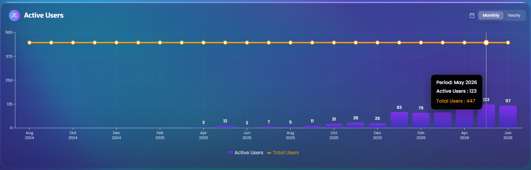
A combined bar and line chart showing the number of active users over time within the selected period.
Time granularity
The chart includes a granularity picker for choosing how the data is grouped. The available options depend on the selected time period:
| Time period | Available granularity |
|---|---|
| Current Month | Daily, Weekly |
| Current Quarter | Weekly, Monthly |
| Year to Date | Monthly |
| Last 6 Months | Monthly |
| All Time | Monthly, Yearly |
| Custom | Depends on the range length - shorter ranges allow finer granularity |
For custom ranges, the rules are:
- Up to 7 days -> Daily
- Up to 30 days -> Daily, Weekly
- Up to 90 days -> Weekly, Monthly
- Up to 365 days -> Monthly
- Over 365 days -> Yearly
Churned Users chart
A combined bar and line chart showing the number of churned users over time. A "churned" user is someone who activated their account but has not had any platform sessions for more than 90 days (see User Engagement - Non-active vs Churned for the full definition). This chart helps identify whether churn is growing or shrinking over time.
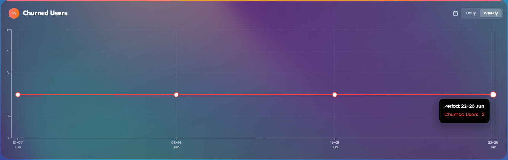
The Churned Users chart has its own independent granularity picker. This means active users can be viewed daily while churned users are viewed weekly, for example.
The same granularity rules from the table above apply.
Scenario Completion Tiers chart
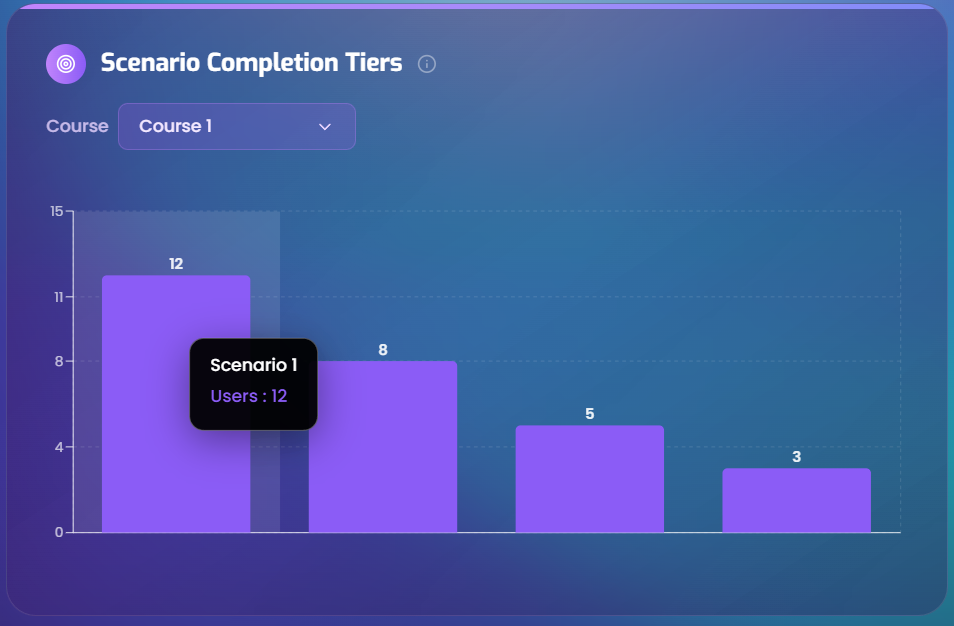
A bar chart that shows how many users completed each scenario. A "completed" scenario means the user ran the simulation and reached the mentor feedback stage (the same definition used in Simulations Played). This is useful for identifying which scenarios are being finished by the most users and which ones might need attention.
Course filter
This chart includes its own course dropdown for focusing on scenarios from a specific course. This is separate from the global course filter and supports drilling into one course at a time within the chart.
What it shows
Each bar represents a scenario, and the bar height shows the number of users who completed that scenario. Scenarios are grouped by the course they belong to.
Most Popular Scenarios chart
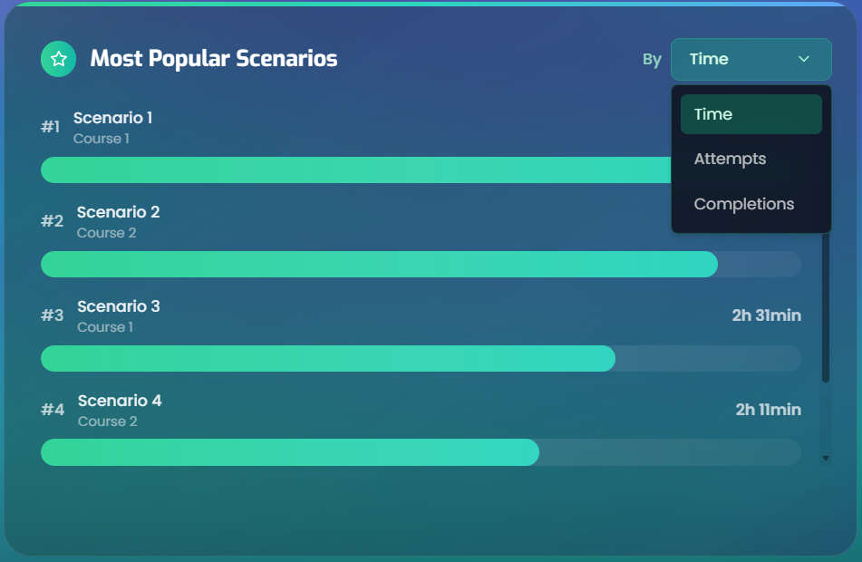
A horizontal bar chart ranking scenarios by different metrics. This chart provides a detailed, scenario-level view of where users are spending time and effort.
Sort options
The chart can be sorted by three different metrics using a toggle at the top. Based on the selected option, each row highlights one of these values:
| Sort by | What it ranks |
|---|---|
| Time Spent | Total time users spent in each scenario |
| Attempts Count | Total number of attempts across all users |
| Completions Count | How many times each scenario was completed |
Course filter
Like the Completion Tiers chart, this chart has its own course dropdown to focus on one course at a time.
Information shown per scenario
Each row in the chart displays:
- Scenario title and its parent course name
- The selected metric: time spent, number of attempts, or number of completions
- A progress bar showing the scenario's value relative to the highest value in the chart for the selected metric. A full bar means that scenario has the highest value among the displayed scenarios, so it is treated as 100%; the other bars show how close each scenario is to that top value.
Navigating from summary panels
The summary panels above the charts include clickable links that scroll to the corresponding chart:
| Panel link | Scrolls to |
|---|---|
| "View Chart" in Active Users | Active Users chart |
| Clicking the Inactive section | Churned Users chart |
| "View Completion Tiers" in Simulations Played | Scenario Completion Tiers chart |
| "View Top Scenarios" in Session Time Flow | Most Popular Scenarios chart |
When one of these links is clicked, the target chart briefly scales up and glows to make it easier to find on the page.